
publications
2024
Davidson P, Bradbury B, Wong M (2024), Inequality in Australia 2024: Who is affected and how.
Australian Council of Social Service and UNSW Sydney
2023
Davidson P, Bradbury B, Wong M & Hill T (2023), Inequality in Australia 2023: Overview.
Australian Council of Social Service and UNSW Sydney
Davidson, P; Bradbury, B; and Wong, M (2023), Poverty in Australia 2023: Who is affected
Poverty and Inequality Partnership Report no. 20. Australian Council of Social Service and UNSW Sydney
2022
Davidson, P; Bradbury, B; and Wong, M (2022) Poverty in Australia 2022: A snapshot
Australian Council of Social Service (ACOSS) and UNSW Sydney.
Davidson, P. & Bradbury, B., (2022) The wealth inequality pandemic: COVID and wealth
inequality ACOSS/UNSW Sydney Poverty and Inequality Partnership
Davidson, P., (2022) A tale of two pandemics: COVID, inequality and poverty in 2020
and 2021 ACOSS/UNSW Sydney Poverty and Inequality Partnership. Sydney.
Inequality in Australia in 10 graphs

This is a potted summary of a much more detailed report on Inequality in Australia which I wrote for ACOSS and UNSW, with Peter Saunders and Jacqui Philips.
The main report profiles the distribution of income and wealth in Australia in 2016, and maps trends from 2000-2016. This is based on statistical analysis of ABS income surveys by Bruce Bradbury and Melissa Wong from UNSW.
We also wrote this supplement, which explores the causes of income inequality and where different groups fit on the income ladder.
This was the second ‘inequality report’ produced by ACOSS and UNSW, and my first publication as principal of NeedtoKnow consulting.
1. Who gets how much?
If you’re in the lowest 20%, your average household disposable income is $735pw.
If you’re in the middle 20% it’s $1779pw.
Thought it was higher? If your household gets $3978pw, that’s the average income of the top 20%.
It’s all explained in the Main Report.
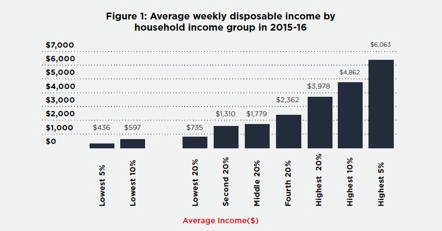
Source: Davidson, Saunders & Philips (2018), Inequality in Australia: Main report (ACOSS and UNSW Sydney)
Note: Individuals are divided equally into household income groups, whose incomes are adjusted for household size (equivalised). However, for ease of presentation, the average incomes for each group are not equivalised. These are weekly household incomes after tax (including social security payments).
2. Some fared better than others in the boom
In the boom times from 2000 to 2008, the average household disposable income of the lowest 20% rose by an average of 5.6% per year (after adjusting for inflation). The middle 20% fared better with 5.9%. But the top 20% got the cream, with remarkable average annual income growth of 7.2%
After the GFC, incomes nearly froze across the board. Average annual income growth was just 0.5%. So inequality plateaued, but so did average incomes.
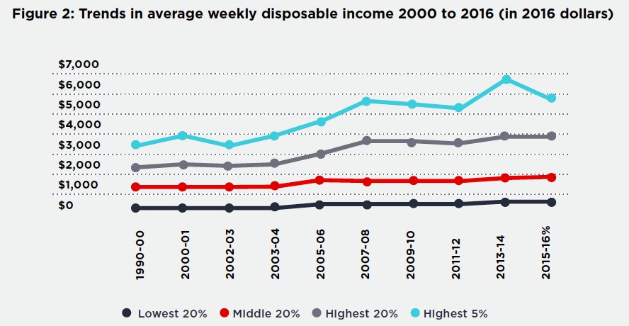
Source: as for Figure 1 above.
3. Wealth inequality is much starker
Wealth inequality is bottled (concentrated) income inequality. For this reason, the wealth divide is much more stark.
The highest 20% have 62% of all household wealth, while the lowest 50% are left with just 18%.
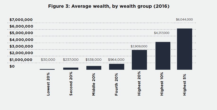
Source: as for Figure 1 above.
4. And wealth inequality hasn’t stopped growing
When it comes to growth in household wealth, all of the action was in the top 40%.
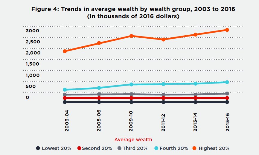
Source: as for Figure 1 above.
5. Where does income inequality come from?
Here we switch from the Main Report to the Supplementary report.
This graph (now starting at Figure 1 again), breaks the income of each household income group into its main components.
For lowest 20%, it’s mostly social security (Age Pensions, working-age and family payments). Here we find more single people, older couples, and sole parents.
For middle 20%, it’s typically one-and-a-half modest wages, and we find more couples with children in this group.
For the top 20%, it’s mostly two full-time wages plus investment income. Here we find more ’empty nester’ couples and people with professional or managerial wages.
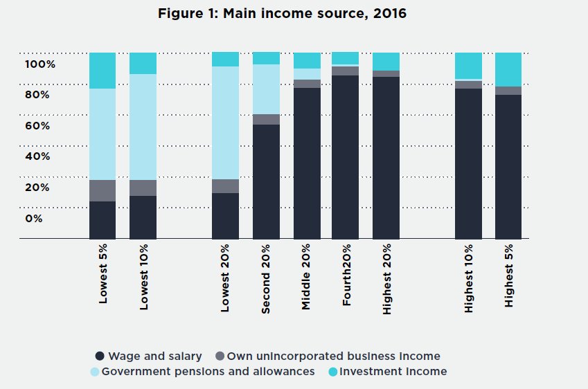
Source: Davidson, Saunders & Philips (2018), Inequality in Australia: Supplementary report (ACOSS and UNSW Sydney).
Note: Proportion of households whose main income source is as described.
6. Paid working hours rise as we move up the income ladder.
Since earnings are more two-thirds of household income, one of the main reasons for income inequality is that higher-income households have more paid working hours.
In the lowest 20%, an average of just 11% of adults have full-time jobs. Many adults in this income group are not in the paid workforce because they are retired, caring for family members, or have an illness or disability.
Among the middle 20%, 42% of adults have full-tome jobs, while in the top 20% it’s 67%.
Conversely, one of the main factors reducing inequality during the boom was falling unemployment, since this mainly increased the paid working hours of people in lower income groups.
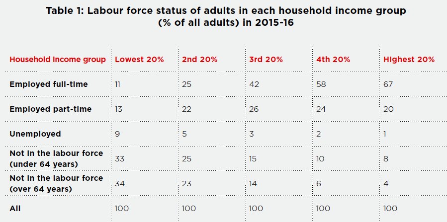
Source: As for Figure 1 above (Supplementary report).
Note: Includes all adults in these households.
7. Inequality of hourly wage rates has risen steadily
Another key contributor to earnings inequality is inequality of hourly pay rates. This has been steadily rising for decades.
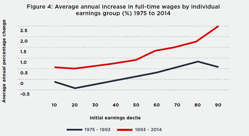
Source: As for Figure 1 above (Supplementary report) and Borland & Coelli (2016), Labour market inequality in Australia, Economic Record, Vol 92, No 299, pp 517–547.
Note: These are individual, not household earnings (including men and women employed full-time).
8: Like wealth, returns from wealth (investment incomes) are very unequally shared

Source: As for Figure 1 above (Supplementary report).
Note: Includes income from superannuation, dividends, rents, and interest (but not capital gains)
9. High income earners cleaned up in the share & housing booms but didn’t fare so well after the GFC
Investment returns are usually more sensitive than earnings (wages and salaries) to economic upswings and downturns. So they were very strong around the time of the GFC (the red bars in the graph below) but then subsidised (the black bars are average returns in 2017).
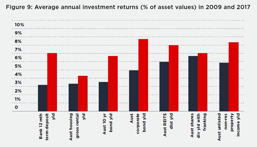
Source: As for Figure 1 above (Supplementary report), and Oliver S (2017): Where are we in the search for yield? AMP Capital, available: http:// http://www.ampcapital.com.au/article-detail?alias=%2Folivers-insights%2Fseptember- 2017%2Fwhere-are-we-in-the-search-for-yield
Note: Red bars represent 2009 and Black bars represent 2017.
10. Social security & income tax reduce inequality, but less than they used to
The social security system reduces income inequality (as measured by the Gini Coefficient, but with a value of 1.0 – complete inequality – represented by 100 percentage points), by around 10 percentage points.
The income tax system reduces income inequality by around 6 percentage points (though the Supplementary Report points out that this is largely offset by the regressive impact of taxes on consumption).
The graph below shows the extent to which these two arms of government reduced inequality (so the higher the value, the greater the equalising impact of social security and income tax).
The equalising impact of social security (represented by the top dots) declined as unemployment fell up until 2008. Social security had a greater equalising effect after the large pension increase in 2009, but later its impact declined again (partly due to social security spending cuts that mainly affected people on low incomes).
The equalising impact of income tax (lower dots) declined in the mid 2000s, due to a succession of income tax cuts from 2003 to 2011.
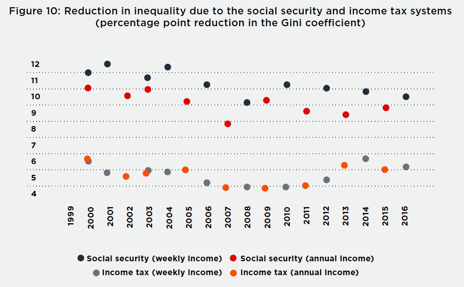
Source: As for Figure 1 above (Supplementary report).
Note: The top dots represent the equalising impact of social security on household income inequality. The lower dots represent the equalising impact of personal income tax.
So governments do make a difference to inequality, for better and for worse!
